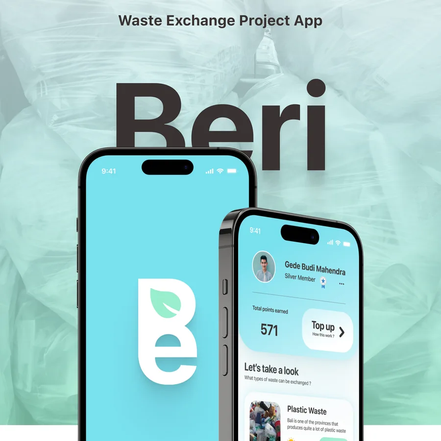
- Role
- Brand & UI/UX Designer
- Type
- Project
- Focus
- Bali, Indonesia
- Year
- 2024
TheProblem
Bali is the largest waste producer in Indonesia, and it is also the island whose image depends on being worth visiting. Plastic waste in particular was outpacing the systems meant to handle it, and the island's image is part of its economy — unmanaged waste is the fastest way to lose it.
Public awareness existed in principle, but nothing turned it into a reason to act today, so the people best placed to reduce the problem had no reason to bother.
TheSolution
Build people's interest and awareness in protecting the island from unmanaged waste by making the act of doing it pay: give plastic a value that can be collected, so sorting it becomes worth the effort, and make the reward real — vouchers and e-wallet balance rather than a score.
Keep the interface simple enough for everyone from a twelve-year-old to an adult to use unaided, and teach as it goes, showing the type of waste scanned and why it matters rather than only the points it earned.
TheProcess

Introduction
Introduction
The product defined: an app for Bali specifically, focused on plastic waste, built around exchange rather than exhortation.

Branding
Branding
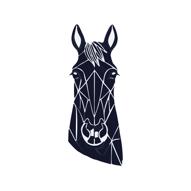
The name, the logotype and the reasoning behind each part of the mark before any interface existed.
- Logotype
- Mark rationale

Typography and colour
Typography and colour
The type scale and the palette settled against the theme — nature, clean air, clean water.

Low fidelity design
Low fidelity design
Wireframes for the whole app, plus a userflow drawn in FigJam to fix the path through it before any screen was dressed.
- Wireframes
- Userflow

SWOT analysis
SWOT analysis
Because every application has to differ from the ones already there, and because an app that cannot fund itself is a poster rather than a product.

Marketing strategy
Marketing strategy
The route to money, drawn from the SWOT: who to work with first, and who to work with once there are users worth talking about.







What's upOn Socials
Follow along on social media